For data visualization using Python, you have quite a lot of options. How to clean your data, how to process and how to visualize it. For each step, there are several libraries in the Python ecosystem available.
In this article about data visualization with Python I focus on the combination of pandas for pre-processing and searborn for the plotting part. As I’m not a fan of standard data sets, I used my bicycle statistics from the years 2015 to 2020 as an example.
I assume that you have a running Python environment on your system of choice already.
How I track my Data
In late 2015 I started cycling more regularly. As I’m a total numbers freak, I tracked all my rides since then. This can be (and was) done with a smartphone app like Adidas Runners but I also track in google sheets. For every ride I wrote down the Date, Distance, Altitude and the Time I cycled.
I used Excel in the beginning but later switched to Google Sheets. Either way: data can be saved as .csv or .xls/.xlsx and used in Python. The lines in this file look like
date;distance;alt;time
02.01.2015;35,1;548;01:59:06
04.01.2015;24,3;391;01:26:03
05.01.2015;34;540;02:00:00
Have a look at how to read data (article tbw) in Python for a more general overview.
Data Mining
I was interested in some data insights, like progress, total distance driven etc. and wanted to do this data visualization using Python. For the visualization I use the libraries pandas and seaborn.
import pandas as pd
import matplotlib.pyplot as plt
import seaborn as sns
import datetime
sns.set_theme() # this sets the plot style for later

df = pd.read_excel('bikedata.xlsx')
Now, the whole data is stored in a DataFrame called df. Let’s get into details!
Data visualization using python
Cleaning the Data
After reading the data, a few steps are needed to prepare the data. E.g. pandas need to know if a column is DateTime format. This can be done with the built in pd.to_datetime() function:
df['date'] = pd.to_datetime(df['date'], dayfirst=True)
Then you benefit by powerful filter and aggregation functions, which make a lot of tasks very easy.
As I like to calculate a few other quantities from the raw data (average pace, velocity, power etc.) I wanted to format the time column to float, e.g. a 1h and 15 min. ride should be converted to 1.25 hours (maybe there is a better way in pandas for this?):
df['time'] = pd.to_timedelta(df['time'].astype(str)) / datetime.timedelta(minutes=1) / 60
Basically this line converts the time column to a duration (a duration can be more than 24:00:00 hours), then divides this duration by a datetime.timedelta object to convert in minutes, and then hours (division by 60 as 60 mins are 1 hour). With print(df.info()) you can check if all columns are there and have the right format.
Rides with and without kids
As I sometimes drive with kids and a bike “trailer”, I wanted to distinguish between rides w/ and wo/ kids. Therefore I used my pace as a proxy. As the kids where not available < 2016 I used pace > 3.75 mins/km as a separator. This is not 100% accurate but for further analysis enough. A scatter plot will do the work:
sns.scatterplot(data=df, x='date', y='pace', hue='kids', size='distance')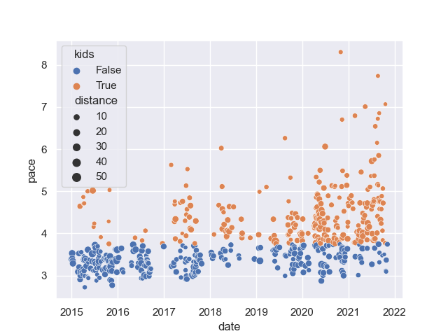
Distance driven by Year
Okay this is really simple (and can also be done in Excel with SUM function or pivot table if you have a proper date column). Nevertheless total distance by year is a major KPI for a cyclist.
The quickest way to get a sum by year is resample the by year. As the .resample functions needs datetime as index, I moved the date column to the index df = df.set_index(df.date). With .resample, you aggregate data over periods (weeks, months, etc.) and calculate sums or averages.
df = df.set_index(df.date)
df = df.resample('Y').sum()
print(df)
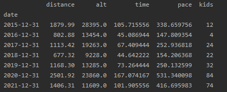
We can plot the aggregated data with a barchart using
df = df.reset_index()
df['year'] = df.date.dt.year
sns.barplot(data=df, x='year', y='distance')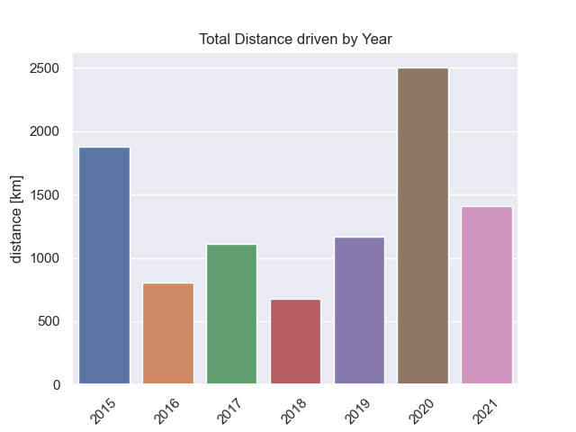
You don’t need to be a data analyst to see sharp drop in mileage from 2015 to 2016 (birth of first child) and also from 2017 to 2018 (birth of second child). However, 2020 was an absolute record year: thanks to COVID-19 and the reduced working hours I had. 2021 is looking solid so far, however the 2020 mileage will not be reached.
Average and Total Distance driven by Month
With the same logic as above, but resampling my month (df = df.resample('M').sum()) I got this plot as a result:
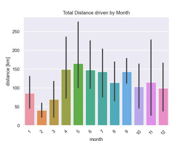
As there are multiple Januaries, Februaries etc. in the dataset, barplot function automatically draws error bars. Not a big surprise, that the summer months from April on are my strongest months.
There is also a way to get the total distance driven by month with the pandas .groupby() function. Read this code as: we want to group by month and sum the values.
sns.barplot(data=df.groupby('month').sum().reset_index(), x='month', y='distance')
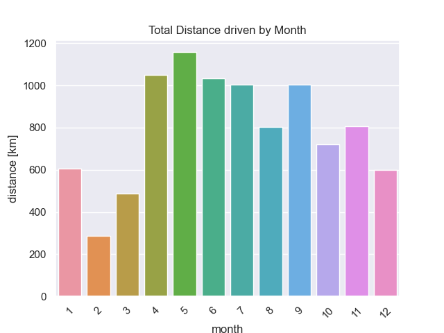
So, April, May and June are my strongest months followed by September which is after the summer holidays. Then, I typically need to loose some weight and July, where I have to get in shape.
Total Distance over time
If we are interested in the total distance driven, we have to build the cumulative sum over the distance column. There is a function for doing that:
df['total_distance'] = df.distance.cumsum()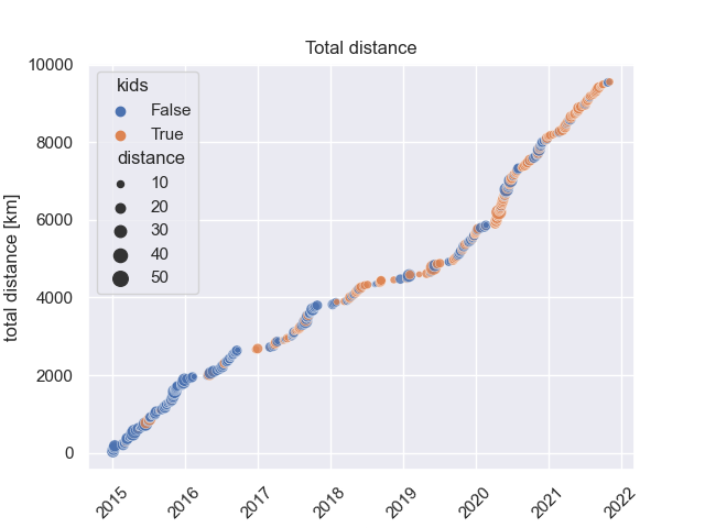
10.000 kms is still possible within 2021!
Training Performance
Evolvement of pace
Making a regression of the pace reveals the truth:
sns.regplot(data=df, x=df.index, y='pace')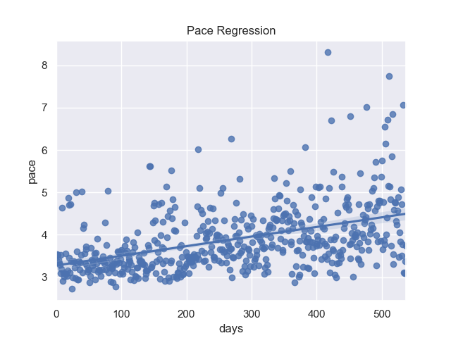
I m getting slower over the years. Unfortunately this is also true if I remove the rides with kids 🙁
Influence of rest days
With a few lines of code we can add, weekdays and weekends, a column with the last training and also the number of rest days between trainings to the dataframe.
df['weekday'] = df['date'].dt.dayofweek df['weekend'] = df['weekday'] > 5df['last_training'] = df['date'].shift(1) df['n_rest_days'] = (df['date'] - df['last_training']) / datetime.timedelta(days=1) - 1 # because yesterday - day = 1, but this means 0 rest dayssns.violinplot(data=df[(df.n_rest_days < 8) & (df.n_rest_days >= 0)], x='n_rest_days', y='pace', hue='kids', split=True)
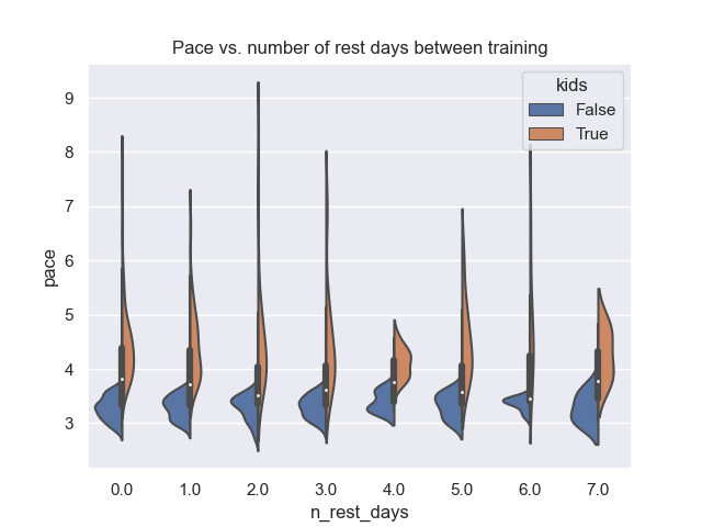
With a violin plot we can see, that the optimum seems to be around 2-3 rest days between training, as the pace is the smallest (highest average speed).
Average Distance by Weekday
The average distance by weekday is as follows:
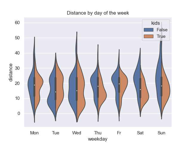
You can see, that on fridays there seems a maximum around 20-24 km for rides with kids: On fridays I tend to fetch them at the kindergarden, which is depending on the exact route 20 km smallest and 24 km largest distance. On thursdays, we see a peak around 24km but for driving alone (kids = false). This was for a while my homeoffice day where I saved the commute time and could spent it on the bike alone.